The ubiquitous pie chart is a longtime favourite for easy vizualisation of data, but it is often not very user-friendly or effective. The 3D pie chart is a particularly bad offender in the realm of data visualization.
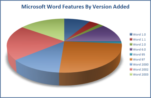
This pie chart displaying number of features in Microsoft Word releases, is a perfect example of such misuse.
Why is this pie chart such a failure in this situation?
1. The eye is bad at judging relative areas, and better at judging linear measures. Therefore it is more difficult to make comparisons between the relative size of slices in the piechart, than between the length of lines or bars in a graph.
2. Adding the 3D effect distorts the area distribution and makes it even more difficult to judge comparisons of relative area size.
3. The data represented here is chronological. The pie chart is trying to tell us the number of new features added per each new version of Microsoft Word that was released. Represented in this format, the reader can’t follow a chronological timeline, but must correspond the relevant colours and read around the piechart.
4. Furthermore, counting the number of features as they accumulate in subsequent released would also be useful information, but it is not shown here.
5. Piecharts should not be used to represent data with numerous classes. This creates many small slices, which the reader cannot distinguish well from each other, and thus information will be lost/ignored in reading. A piechart with 2 or 3 can be a fast and effective way to communicate a point, but more slices than that quickly becomes trouble.
6. The chart has no values on it, thus the reader has no idea of the difference in number of features. Were there 2 new features added? 7? 70? Adding an actual number or a percentage would make the chart more informative, relevant and user-friendly.
So what would have been a better visualisation? I would suggest a line graph or bar graph. There would be enough space to represent all the categories clearly, the information could be shown chronologically and display accumulation, and visual judgement could be improved by using linear visualisation of the data.
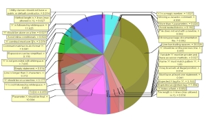
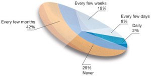
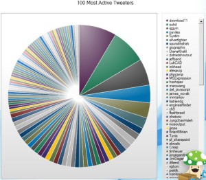
To emphasise my point, I include some other examples of unsuccessful data visualisation using pie charts:
Source: http://informationdesignmdippold.wordpress.com/examples/
Source: http://eagereyes.org/criticism/march-chart-madness
Source: http://www.datavis.ca/gallery/evil-pies.php


Great post! On the six point i would like to add that its not necessary adding the data values. The most extended use of pie charts are for visualizing percentages so you can figure how something it is distributed.
Thanks for the feedback German!
Pingback: One less pie chart on Pi Day