The analysis of analyses

Primary analysis refers to the analysis of data from a single study to test the hypothesis originally formulated. When a number of individual studies have been conducted on the same topic, it can be interesting and valuable to do a further study on all the separate studies, to determine whether they indicate a pattern, relationship, or source of disagreement. One option is to do a literature review, as a narrative, to explain the various papers. However, this method does not allow further statistical analysis to be applied.  Therefore another method has been developed, in order to overcome this barrier.

This statistical method is known as meta-analysis, which can be defined as a complex method for analysing a collection of  data from several studies, in order to define a single conclusion with greater statistical significance. As each study will have it’s own methodology, statistical application, experimental population and even geographic setting, it is extremely challenging to amalgamate these individual units into a cohesive summary. This type of analysis has advantages and drawbacks, for a number of reasons that I will elaborate.

Advantages: Greater statistical power, confirmatory data analysis, greater ability to extrapolate to general population affected, considered an evidence-based resource (GWU 2012), inconsistencies can be analysed, the presence of publication bias can be investigated.

Disadvantages: Difficult and time consuming to identify appropriate studies, not all studies provide adequate data for inclusion and analysis, requires advanced statistical techniques, heterogeneity of study populations (GWU 2012).

Case study: organic vs. conventional farming

To explore this method further, I present an example of a published meta-analysis on organic farming. In 2012, Tuomisto et al. published a meta-analysis of European research that studied whether organic farming reduces environmental impacts, in comparison to conventional farming methods. From the 71 studies providing data for the meta-analysis, the research extracted 170 cases, since each study generally provided results from multiple farming systems. Those cases provided 257 quantitative measures of the environmental impact of organic and conventional farming. Ten indicators were used to compare the environmental performance of the two systems, including soil organic matter, nitrogen leaching, greenhouse gas emissions, energy use, and biodiversity. Furthermore, they conducted a straightforward narrative literature review of 38 studies. They extracted both quantitative and qualitative data from the studies in order to compare the impacts and explain the differences between them. Data analysis involved calculating the response ratio for each indicator, Response ratio = [(impact of organic farming/impact of conventional farming) – 1], with negative values indicating lower impacts from organic farming versus conventional, and positive values indicating higher impacts from organic farming.

Tuomisto et al. (2012) found that organic farming practices generally have positive impacts on the environment per unit of area, but not necessarily per product unit. “Organic farms tend to have higher soil organic matter content and lower nutrient losses (nitrogen leaching, nitrous oxide emissions and ammonia emissions) per unit of field area. However, ammonia emissions, nitrogen leaching and nitrous oxide emissions per product unit were higher from organic systems. Organic systems had lower energy requirements, but higher land use, eutrophication potential and acidification potential per product unit.” They found great variation in the results of the indicators due to differences in the systems compared and research methods used.  Conducting this meta-analysis allowed the researchers to recommend that “in order to reduce the environmental impacts of farming in Europe, research efforts and policies should be targeted to developing farming systems that produce high yields with low negative environmental impacts drawing on techniques from both organic and conventional systems”.

Conclusion

Although meta-analysis has some significant drawbacks in its application, if used carefully and transparently it can be a valuable tool in the world of research, providing statistically-based literature reviews. It is important to remember the limits of this method, and be aware of them when designing or interpreting a meta-analysis. As summarised by Fagard et al. (1996), “Meta-analysis is superior to narrative reports for systematic reviews of the literature, but its quantitative results should be interpreted with caution even when the analysis is performed according to rigorous rules”. If you are interested to explore this particular topic further, here are some other recently published meta-analyses on organic vs conventional farming, by Mondelaers et al. (2009)Seufert et al. (2012), and de Ponti et al. (2012) to provide comparison.

References

de Ponti, T., Rijk, B. and van Ittersum, M.K. (2012) The crop yield gap between organic and conventional agriculture. Agricultural Systems 108:1-9. http://models.pps.wur.nl/sites/models.pps.wur.nl/files/AGSY1644.pdf

Fagar, R.H., Staessen, J.A., and Thijs, L.  (1996) Advantages and disadvantages of the meta-analysis approach. J Hypertens Suppl 14:9-12. http://www.ncbi.nlm.nih.gov/pubmed/8934372

George Washington University (2011) Study Design 101: Meta-analysis. http://www.gwumc.edu/library/tutorials/studydesign101/metaanalyses.html, accessed 20 April 2013.

Mondelaers, K., Aertsens, J., and Van Huylenbroeck, G. (2009). A meta-analysis of the  differences in environmental impacts between organic and conventional farming. British  Food Journal 111 (10), 1098-1119. 10.1108/00070700910992925

Seufert, V., Ramankutty, N., and Foley, J.A. (2012) Comparing the yields of organic and conventional agriculture. Nature 485: 229-232. http://serenoregis.org/wp-content/uploads/2012/06/nature11069.pdf

Tuomisto, H.L., Hodge, I.D., Riordana, P. and MacDonald, D.W. (2012) Does organic farming reduce environmental impacts? A meta-analysis of European research. Journal of Environmental Management 112:309-320.
Demonstrating data manipulation with indiemapper

Introduction

indiemapper is a free, web-based application that allows anyone to easily create static, thematic maps. I highly recommend it for beginners, as I found it intuitive and user-friendly.

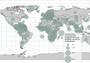
You can create geovisualisation with your own input, or use indiemapper’s library of data, shapefiles and vectors. The data library contains a range of interesting topics from reputable sources such as FAO or World Bank. I uploaded the data on Global Protected Terrestrial Areas (IUCN Categories I-VI) from the United Nation Environmental Program- World Conservation Monitoring Centre (UNEP-WCMC). The data displayed what percentage land area of every country was classified as a Protected Area within IUCN Categories I-VI.

Data visualisation methodology

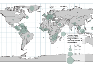
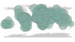
I first loaded the data as symbols, displaying circles with their size proportional to the percent of a country’s land located in a protected area. I also added a legend explaining the size of the circles related to percentage of the country in a protected area. The automatic indiemapper colour is an opaque green-grey. It looked like this:

1

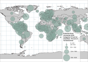
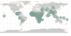
This data visualisation was somewhat messy and unuseful, so I played around with it some more. I selected the data to be ‘classed’ by equal interval, and  decreased the overall size of the symbols. However this still left rather large symbols that obstructed a clear view of that data and the country borders, like this:

2

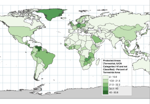
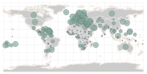
Just to emphasise the way methodology can affect data visualisation and thus impact on the viewer’s perception, I then selected the data to be classed by quantiles. This representation has a radically different appearance, with exactly the same data:

3

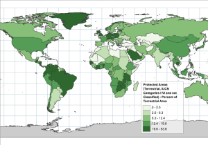
It is clear that the proportional symbols are not giving a clear and user-friendly visualisation in this instance,  thus I chose the chloropleth map to explore next, setting the colour scheme to a gradient of green. I started with the data classed by equal interval. Now it becomes more clear, and easy to read the map. Using this categorisation, it looks like hardly any countries around the world have high percentages of protected areas, except for Venezuela which looked to be leading in the conservation stakes!

4

However, when I change the class categories to quantile, the data visualisation is completely changed. It now looks like parts of South America, Greenland and parts of Africa and Europe all have very high percentages of protected areas.

5

Conclusion

From this example, we can see how easy it is to manipulate an analysis, using exactly the same data to give extremely varied results. Thus it is important to 1) maintain transparency with regards to analysing and visualising data, so that others may easily see your methodology, and to 2) think critically when reviewing the work of others, trying to be aware of hidden motives and manipulation.

Improved water coverage displayed in Indiemapper

Indiemapper

Indiemapper is a convenient way to show map visualization.  I found its strength is it can input data from indiemapper’s own library.  I opened data library and selected “Health”. It tells me that the data of “Health” is from WHO. I choose improved drinking water coverage in total population:

11


I changed the size of circles and move the number to mean value:

12


Then we can see more clear that most of improved drinking water coverage is in Africa.

I put five classes and use Quantile method:

13


We can see althrough the amount is large in Africa but high quality water coverage is in Europe.

Exploratory Data Analysis – Titanic Case

Exploratory data analysis assumes the test in order to form a data analysis method and a supplement to traditional statistical hypothesis testing mean. The method is named after the famous American statistician John Tukey.

Titanic was a British passenger liners that sank in the North Antarctic Ocean on 15 April 1912 after colliding with an iceberg during her maiden voyage  from Southampton, UK to New York, US. The Titanic sinking caused the deaths of 1,502 people .

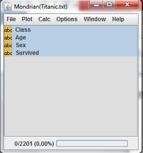
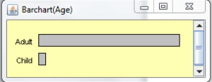
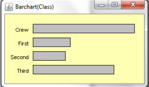
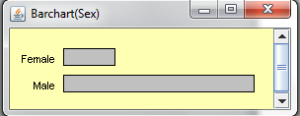
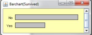
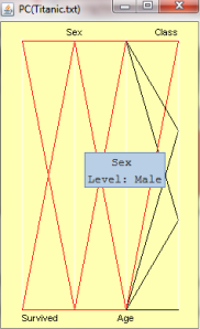
I present the data from Titanic by Mondrian.  Through analyzing by Mondrian, we can see the survivors in different categories: Class, Age and Sex.

Open a txt file of Titanic data and we select all categories which are in the window:

1

2 3 4 5

Display by Parallel Barplot:

6

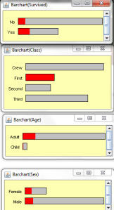
We can click first class and see how it goes::

7

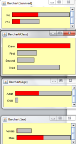
Then we see crew:

8

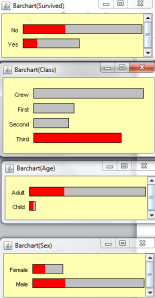
And the third class:

9

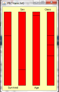
Present by Parallel Coordinate

10

Then we can see that the majority of survivors are passengers in first class. Most casualties are passengers  in crew and third class, and among them are male adults.

Data and Scientific Knowledge

Information technology is transferring things in the real world into CYBER storage space in the form of data. These data are a representation of nature and life, these data also recorded human behavior, including work, life, and social development. Today, data is quickly and in large numbers produced and stored in the CYBER space, this phenomenon is called data explosion. In addition, the exploration of the laws and phenomena of data is to explore the laws of the universe, to explore the laws of life, looking for the laws of human behavior, an important means to find the law of social development, such as: research data to study the life (Bioinformatics), the study of human behavior (behavior informatics).Data reproducible and transparent.  In the article Reproducible research and Biostatistics, the author, Peng pointed that “reproducible research requires that data sets and computer code be made available to others for verifying published results and conducting alternative analyses”.  This theory is mainly used in biostatics.

How to make data show scientific knowledge? Nowadays R is one of the best choice. R contains a large number of data and all the data can downloaded from R library.  In Scott Chamberlain’s slides- Web Data Acquisition with R-he gives us three reasons to use R: the first one is getting data from a web takes too long time; the second is workflow integration; finally,  your work is reproducible and transparent if done from R.  I also read a book from O’Reilly, called Exploring Everyday Things with R and Ruby . First of all, O’Reilly introduces R and Ruby in two chapters. Then in the third chapter, he solves the problem of the number of toilets in the office, using Ruby to simulate the number of people on the toilet, and then use R to draw every possible situation.  In the forth chapter he establishes a simple dynamic system, including producers, consumers, the price and the market, and these factors were simulated. In his book, one of the interesting thing is he uses mails in Ruby library to obtain the Enron scandal in the e-mail data and email, and then use the R time distribution description and text mining.

Data can be used as a symbolic representation of information and knowledge, or carrier, but the data itself is not information or knowledge. Data science research object is the data, rather than information is not knowledge. We obtain the understanding of nature, life and behavior, and thus access to information and knowledge by studying the data. The data object of study and research purposes and research methods are essentially different from the existing computer science, information science, and knowledge science.

Natural phenomena and laws of natural science research is the object of knowledge throughout nature and substance of all types of nature, status, attributes and forms of exercise. Behavioral science is the scientific study of human behavior in the natural and social environment as well as low-level animal behavior, has been recognized disciplines, including psychology, sociology, social anthropology, and other similar disciplines. The data learning support natural science and behavioral science research. With the progress of the science of data, more and more scientific research will directly address data, which will enable the human understanding of data to understand nature and behavior.

In the process of explore the reality of human nature and the discovery of human computer processing, human society, nature and people, data has been produced in large amount. We have created a more complex data nature.  What we believe now, can be defeated by analyzing by data. Is data a more reasonable approach to tell truth? Ioannidis used modeling to examine most published research findings are false.  Data is a more scientific way by a variety of detection methods.

We have a lot of tools and software, like R, but still can’t be used widely because R needs a solid knowledge of statistics and English skills. Sometimes these reasons can increase the difficulty of data analysis. What we can expect now is looking forward to new data analysis tools.


John Snow and the cholera outbreak

John Snow was once a well-known doctor in London. He had excellent medical skills, so that Queen Victoria fired him as her private doctor. Cholera was a deadly disease at the time, people did not know its cause, nor understand its treatment. There were two views of cholera causes: The first view is the cholera virus breeding, it was like a surge of dangerous gases float around in the air, until the victims of the virus found. The second view is that people eat when the virus into the body. Virus attack from the stomach rapidly bring disaster to the whole body, the patient will die soon.

John Snow speculated that the second statement was correct, but he needed evidence. Thus in the 1854, London cholera outbreak again when he was preparing for his investigations. When the rapid spread of cholera in the slums, he began to collect data in two specific streets. The cholera epidemic was very serious, resulting in more than 500 people died within 10 days. He determined to identify the reason.

First, he marked on a map the exact place where all the dead live. This provided him with a description of cholera causes valuable clues. Many of the dead are near the water pump in Broad Street (especially the street, 16,37,38 and 40). John Snow also noted that some of the residents (such as the width of the street, No. 20 and No. 21, Cambridge street No. 8 and No. 9) had bare death. He did not expect it and he made ​​a further investigation. He found that these people are working in Cambridge Street on the 7th of pubs and taverns to provide them with free beer, so they do not have to drink the water pump pumped water. Cholera epidemic seems to be blamed on the drinking water.

Second, John Snow investigated the water resource of these two streets. He found that water is calling from the river, and the river was in London the dirty water pollution discharge. John Snow immediately called wide panic of the people in the streets removed the pump handle. In this way, water pumps could not be used. Soon, the epidemic has been alleviated. The map contains —the street names, breweries,  workhouses, and water pumps—the map revealed an overwhelming connection between the Broad Street pump and cholera transmission. However, what we can’t see from John’s map, it is time.  After the handle was removed, there are still people dead because it was too late. If we use different sized points represent different month, the death can be visualized better.

Before this map, John Snow created a map during his South London study that featured handinked dots, which were hard to read, and cloudy colors that tried, but failed to show the connection between cholera deaths and water sources. Snow also published a table to tell the same story. But it wasn’t quite right. It lacked key pieces of information gleaned.  After these failures, Snow realized to tell the truth of data, he needed to make some variables and their connections visualized.

The cholera outbreak in London tells us sometimes visualization is better than calculation.  Data visualization is presenting the fact into maps or other tools. Map, the ground coordinates information visualization and generates graphical tools, it is easier for people to explore the relationship of them, then discover hidden truths. Let’s zoom out. Any thing or fact is one type of information: tables, graphics, maps, and even text, whether static or dynamic, and provide us with a means of understanding the world. Visualization will be several times to enlarge their power.


Something old, something new, something borrowed

The scientific community and its well established methods of proving scientific knowledge  and disseminating it are being scrutinized by blogs.  Is this something  old , new or borrowed?

In the ever more competitive environment the scientific community finds itself, there is a strong pressure to either publish peer reviewed articles or perish. As a consequence there has been a strong increase in fraud and retraction of peer reviewed articles.

On the other hand, thousands of scientific blogs have sprung across the internet to disseminate scientific knowledge and provide an open fora for debate – yet having no proof of veracity other then their reputation.

As a consequence of these two phenomena, replicability and reproducibility factors -as considered by the peer reviewers of a supposed scientific finding- are no longer the only qualifying factors for result and findings to be considered scientific knowledge.

Recently Bharat B. Aggarwal, PhD of the Department of Experimental Therapeutics, MD Anderson Cancer Center, Houston,  a prominent and widely respected scientist who has published very influential articles on the healing properties of herbs is facing a university investigation into his research methods,  as a reaction to criticism by several bloggers[1]. This not an isolated case and illustrates the influence that blogs have built and the fragility of the term- scientific knowledge.

Something old

In a certain way it is not something new to the scientific community, as the definition of scientific knowledge evolved through the centuries and with it the methods of proof.

 A good illustration of such progress can be seen through the Sokal affair.  Alan Sokal, a physics professor at New York University submitted in 1996 a hoax article to Social Text, an academic journal to test the journal’s intellectual rigor and highlight the inefficiency of having non peer reviewed journals.

Something new

The methodology of using a blog to disseminate, criticise and/or publish scientific knowledge is certainly new. Never in the past have scientists and non scientists been able to discuss on the same fora a given issue all over the planet  and instantaneously.

Nevertheless, as is always the case, there are also dangers of science blogging.  There are no mediators as to whom post or not, who comments or not so pseudoscientists get mixed with real scientist! It is all based on reputation, referencing/citation and publicity.

Something borrowed

Blog influence has had an enormous effect on all spheres of our lives and all possible economic and scientific sectors. However it is in the fashion and politics sectors that blogs have developed the most influence- it can even be speculated if they have reached their stagnation point?.

The Sartorialist has approximately 13 million page views per month[2] and Wikileaks has become the most well known source of classified information  are two clear examples of the level of influence blogs can achieve in their respective spheres of influence.

How will the scientific community adapt to the changing environment and how will blogging modify the way scientific knowledge is acknowleged and disseminated remains to be discovered.

Dynamic DM Processes & Creating Innovation Space

How relevant are the Decision Making processes in today’s industrial fabric? Here we are, willing to reduce Carbon footprint, increasing the environmental footprint and we also talk about increasing the process efficiency! What is really interesting to observe is that, we still stick to the 20th century DM processes. Where the models are rigid and are not flexible on day to day variations. Like traditional processes, they are normally accounted and documented and then a feedback sessions are carried out after a month (at best) and the ‘talks’ about revisions are entertained. Here, we bump on to a major hurdle which is lack of room or space for innovation. The processes are not designed to accommodate beyond 10% variation and they stand a risk of total collapse or a seizing opportunity.

Is that really enough?

I made a small attempt to think in the direction, what if, we develop a tool which is Dynamic (in true sense) and where processes starting from production to logistics related issues to inventory management can be regulated on a day to day basis? Will that push us towards a six sigma model? I would like to think of linking risks and performances. A computerized model, which can update and regulate itself on real time basis and a system which can accommodate such variations.

But again, not everything can be computerized. Afterall, like the pilots claim, computers can never have the ‘instinct’ of a human. Here, we are talking about a computer integrated human interface. It can not be denied, the best DM processes come from the interactions of different human minds because unlike computers they are not programmed!

We have to be mindful of the fact, the processes, the technologies or even the dynamic DM tools are the best generated thoughts of the present generation and is limited to the resources available today! It is high time to understand that what is more suffocating than stagnant ideas is the limited scope of upgrading a technology, where ideas are brushed out because the processes are not designed to suite the needs of the next generation! 

The DM process, which we are trying to develop, shall contain that 30% room for upgradation in all the aspects. I would rather like the tool to phase out in 10 years (by the time we are left with 10%) and the processes so strong that it could accommodate the innovations 20 years hence and where people can think of attaining or go beyond six-sigma. That would be a mark of a ‘Dynamic’ processes in true sense. That’s how we would like to generate a space for innovation inside our DM tool.

Tiruchirappalli Waste Generation Pattern

Tiruchirappalli Waste Generation Pattern

Tiruchirappalli Waste Generation Pattern

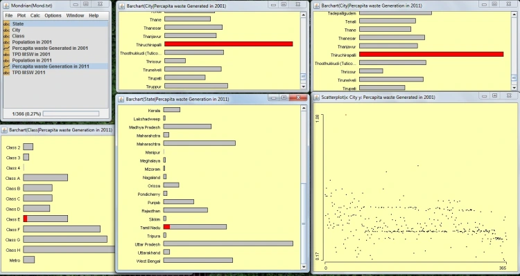
In the process of analysing the MSW (Municipal Solid Waste) generation pattern in India, I came across an outlier in the scattered plot. On observing this abnormal behaviour, I created a new excel sheet for Mondrian (just to be sure). The results were the same. I created multiple bar charts for a better behavioural analysis. The charts included waste generation pattern in India (state-wise), City Tiers, MSW (TPD) of Tiruchirappalli in 2001 and MSW (TPD) of Tiruchirappalli in 2011.

On selecting the outlier, the result was confirmed! Tiruchirappalli indeed produced maximum waste in India but what was rather surprising was the fact it was a Class E city with a very small population. This intrigued a question: why? While hunting for the answer I stepped onto many interesting facts associated with this case.
Waste Water Management in Trichy are handled by the state Government board (TWAD) and by the municipal corporation.
Trichy has been a hotspot for industrialization ranging from Distilleries and Chemicals Limited (TDCL), which are major causes of water related concerns, to Cigar manufacturing. The Ordnance Factory Tiruchirappalli (OFT) and Heavy Alloy Penetrator Project (HAPP) are defence establishments located in that region along with other manufacturing units of engineering equipment. It is also a home to Bharat Heavy Electricals Limited (BHEL), India’s largest public sector engineering company.

At last but not the least, the most interesting part is Trichy’s Slum Clearance movement was the real choke in the pipe. When the city slept, an untold and unknown community moved on the streets and cleared of the waste from the street and recycled them in house. Close to 1,200 houses were developed (a few still in the process) in 36 different-slum site. This not only created havoc for the slum dwellers but also piled up the trouble for the city and its waste management.

A strategic plan for slum removal and a stakeholder analysis are very essential components in human and social welfare activities which clearly did not happen as it should have!