Something old, something new, something borrowed

The scientific community and its well established methods of proving scientific knowledge  and disseminating it are being scrutinized by blogs.  Is this something  old , new or borrowed?

In the ever more competitive environment the scientific community finds itself, there is a strong pressure to either publish peer reviewed articles or perish. As a consequence there has been a strong increase in fraud and retraction of peer reviewed articles.

On the other hand, thousands of scientific blogs have sprung across the internet to disseminate scientific knowledge and provide an open fora for debate – yet having no proof of veracity other then their reputation.

As a consequence of these two phenomena, replicability and reproducibility factors -as considered by the peer reviewers of a supposed scientific finding- are no longer the only qualifying factors for result and findings to be considered scientific knowledge.

Recently Bharat B. Aggarwal, PhD of the Department of Experimental Therapeutics, MD Anderson Cancer Center, Houston,  a prominent and widely respected scientist who has published very influential articles on the healing properties of herbs is facing a university investigation into his research methods,  as a reaction to criticism by several bloggers[1]. This not an isolated case and illustrates the influence that blogs have built and the fragility of the term- scientific knowledge.

Something old

In a certain way it is not something new to the scientific community, as the definition of scientific knowledge evolved through the centuries and with it the methods of proof.

 A good illustration of such progress can be seen through the Sokal affair.  Alan Sokal, a physics professor at New York University submitted in 1996 a hoax article to Social Text, an academic journal to test the journal’s intellectual rigor and highlight the inefficiency of having non peer reviewed journals.

Something new

The methodology of using a blog to disseminate, criticise and/or publish scientific knowledge is certainly new. Never in the past have scientists and non scientists been able to discuss on the same fora a given issue all over the planet  and instantaneously.

Nevertheless, as is always the case, there are also dangers of science blogging.  There are no mediators as to whom post or not, who comments or not so pseudoscientists get mixed with real scientist! It is all based on reputation, referencing/citation and publicity.

Something borrowed

Blog influence has had an enormous effect on all spheres of our lives and all possible economic and scientific sectors. However it is in the fashion and politics sectors that blogs have developed the most influence- it can even be speculated if they have reached their stagnation point?.

The Sartorialist has approximately 13 million page views per month[2] and Wikileaks has become the most well known source of classified information  are two clear examples of the level of influence blogs can achieve in their respective spheres of influence.

How will the scientific community adapt to the changing environment and how will blogging modify the way scientific knowledge is acknowleged and disseminated remains to be discovered.

A COMBINATION OF A MIX

Now-a-days there are tonnes of different programmes and tools available online for any and all purposes. Sometimes one programme will do the job just fine but others you just need the combination of more specialised tools in order to achieve the desired outcome.

Recently  I had to use Excel, QGIS(QuantumGIS),Indiemapper and Inkscape successively in order to create a map. This might seem excessive, however it did end up delivering a good result. I am no specialist of these programmes but when I found myself having to use them the first time they were all fairly straightforward and for most doubts there is always a tutorial somewhere on the internet.

I thought it might be useful to give a brief tutorial not on specific issues of each programme or their characteristics but instead on the basic ideas and steps needed to create a map(or any object with the purpose of data visualization)from start till end using a variety of programs.

1. Starting of with a dataset, it can be in any format-depending on the topic of your analysis. I started of with an Excel file, which I modified as I needed to get the necessary data

.Screen shot 2013-04-10 at 12.47.52 AM

I added a column with the country code as my data was missing it. It can be tricky to assign each country the country code but it will make it easier later on.

Save as a tabular format, preferably .csv, be aware that sometimes if you use Excel for data modification the different formats of the columns affect how they are saved, so if you have any problems also try changing this settings and saving the data again.

Screen shot 2013-04-10 at 12.53.24 AM

  1. Once the data is ready, it needs to be linked to a shapefile or other spatial-formats in order to be plotted on a map in the correct Geographic region.

A very good tutorial for this part of the project is given here: http://qgis.spatialthoughts.com/2012/03/using-tabular-data-in-qgis.html

QGIS is used for joining the two data set (you could probably use other programmes for it as well such as “R”). Once you create your vector with the joined  data you can colour graduate the map in QGIS and add symbology, however I find it easier to do  in Indiemapper.

3. Opening indiemapper, you will have the option to import your saved shapefile, more specifically the .shp and .dbf

Screen shot 2013-04-10 at 1.42.18 AM

The .dbf is what will allow you to colour your map and not only put symbols on the geographical area, so don’t forget to import it.

Once the shapefile is imported, select the variable (“Attribute”) you want to visualize on the map and select the according format of visualization(“Map type”).I selected Choropleth which allows you to color in the map.

Screen shot 2013-04-10 at 1.45.13 AM

Screen shot 2013-04-10 at 1.48.17 AM

There are different options of coloring “Sequential” and “Diverging”, select also the best classification parameter for your data by selecting the “Number of classes” and “Method”, which allows you to classify by: Equal Intervals, Optimal breaks, Quantile and Manual.

If there are other variable to be displayed on the map, click on the + sign that appears next to the name of your shapefile. And repeat previous steps.  I added the Average Net Trading Position of each country as a Proportional Symbol.

Screen shot 2013-04-10 at 1.52.54 AM

You can play around with the colour, thickness, and size of the symbols till you find what suits best your map.

If you want to display the legend, click on the “Layout Objects”->”Legends” and select the ones you want to display.

Screen shot 2013-04-10 at 1.56.10 AM

It is not possible(yet) to edit the text of the legends, without having to rename the original data and going through the joing together. So another way around it  is to use Inkscape.

4. Open Inkscape, select Import File or Open.

Screen shot 2013-04-10 at 2.02.46 AM

Before doing anything else I suggest you redefine the page to the image in order to avoid problems when saving at the end. Go to File-> Document Properties-> Resize page to drawing or selection

Screen shot 2013-04-10 at 2.04.39 AM

Use the text tool to edit the legends(F8)(A on the left hand side),add titles and other modifactions you may want to add.

Screen shot 2013-04-10 at 2.14.39 AM

And there you have the final result, there are different formats available for exporting. (I would suggest .pdf as it  maintains the best visual even after resizing IMO)

Screen shot 2013-04-10 at 2.18.49 AM

Hope its useful.

Enjoy 🙂

Sometimes less is more

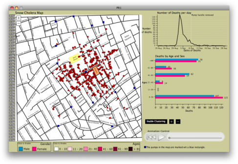
John Snows cholera map and data can and have been recreated in many many ways. After a little research on the web the best take on this information, that I have found, is provided by Mvictoras using Processing  as his tool. He created an interactive map, which allows to view the time spatial distribution of the disease and also included barcharts relating to the age, sex and clustering.

Image

This is a great way of including all data gathered in a clear and scientific way.

However, what I find most appealing of John Snows cholera map is its simplicity and effectiveness.

John Snow did not include all the data he had gathered in order for his map to transmit a very clear message. And the final result proves him to be right, since then London has not experienced another outbreak of cholera.

This is not to say that detailed analysis is not necessary or that visualization always needs to be stripped down to the minimum.

But purpose and audience must be the guiding principles when visualizing data.

Sometimes less is more.